BrainVoyager v23.0
Volume Maps
For brain imaging application it is useful to integrate volume maps in the volume rendering process, which enables, for example, to visualize activated brain regions. When opening the volume renderer, the program checks whether a volume map file is linked to the current anatomical dataset. If this is the case, the volume map file is loaded. Alternatively, one can use the Load Maps button in the Volume Renderer Controls panel to load any (matching) volume maps file. If a VMP has been loaded, the Volume Maps panel is displayed automatically (see left side in screenshot below), and it can be toggled using the Maps Panel entry in the context menu of the Render View. The rendered view shows map values outside (in front of) the "underlying" anatomical data as well as inside the brain - albeit weaker and blended with the anatomical (grey scale) colors.
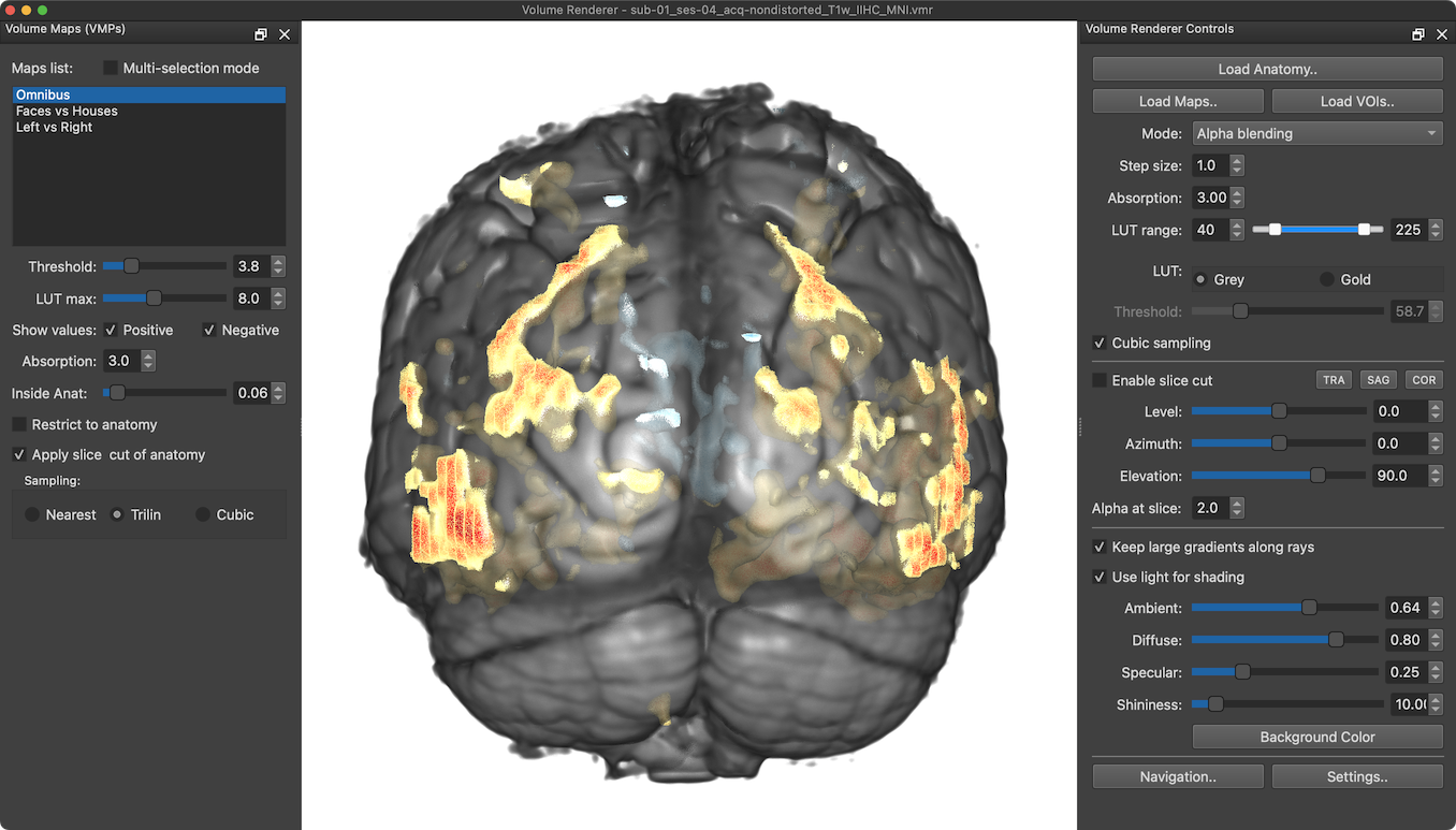
In the example snapshot above, the Volume Maps panel shown on the left lists 3 volume maps that have been loaded from the volume maps file linked to the VMR dataset. The first available map ("Omnibus") is selected automatically. A selected map is included in the volume rendering as shown in the Render View on the right. Note that the loaded maps are incorporated in volume rendering with their respective color look-up table (LUT) definitions and statistical threshold (a cluster-size threshold is planned for a later release). As with VMR View map overlays, the threshold value not only excludes smaller map values but its value is also assigned to the lowest value of the color LUT (red). The LUT max slider (and spin box) sets the highest value of the color LUT (without thresholding higher map values). This allows to adjust the displayed color range. In the screenshot below the LUT max value has been set to the same value as the Threshold value (3.8) rendering all positive map values red and all negative map values blue.
Looking Inside
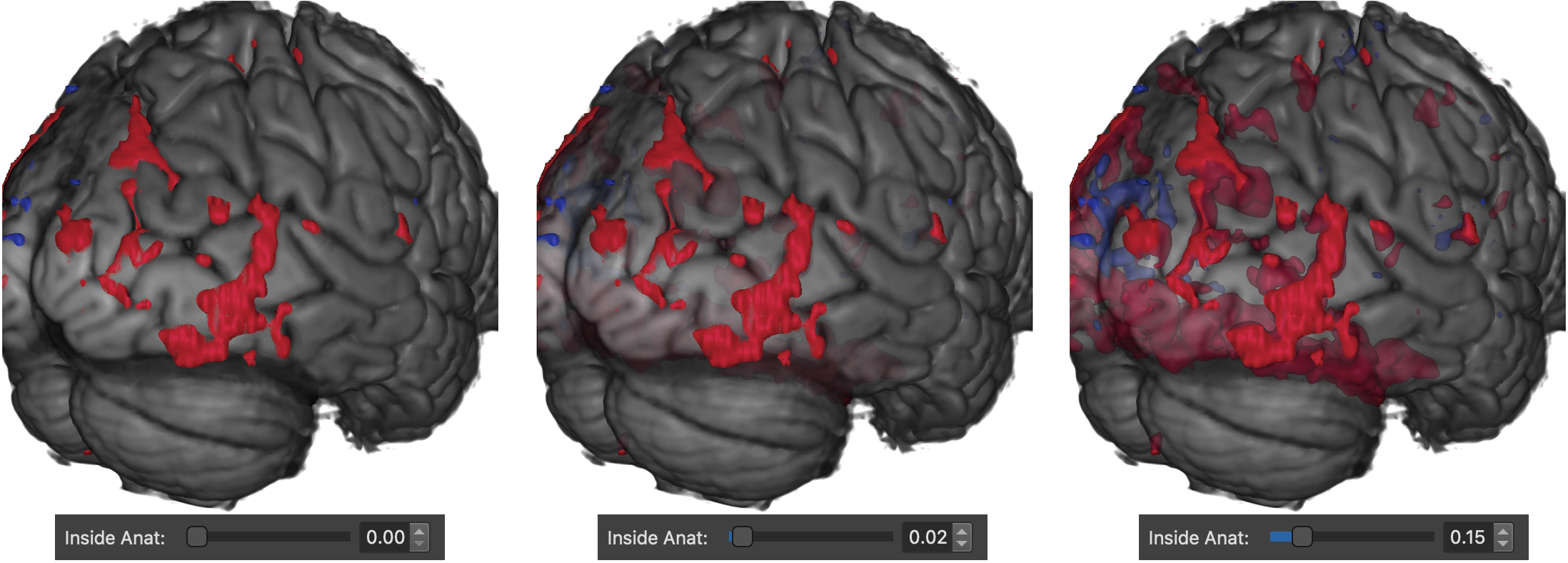
Using the Inside Anat slider (and spin box), the volume renderer allows to specify how much one can see volume map values inside the brain. On the left side in the screenshot above, the Inside Anat value is set to 0.0 hiding activity inside the brain, and, thus, rendering only map values that are outside (in front of) the brain. In the middle view, an Inside Anat value of 0.02 has been used leading to a render result showing map values inside the brain but only weakly. On the right side an Inside Anat value of 0.15 has been used, which shows hidden values inside the brain much stronger than in the middle view. Note that one can restrict the displayed map values to only show positive values, negative values or both by using the Positive and Negative options of the Show values field.
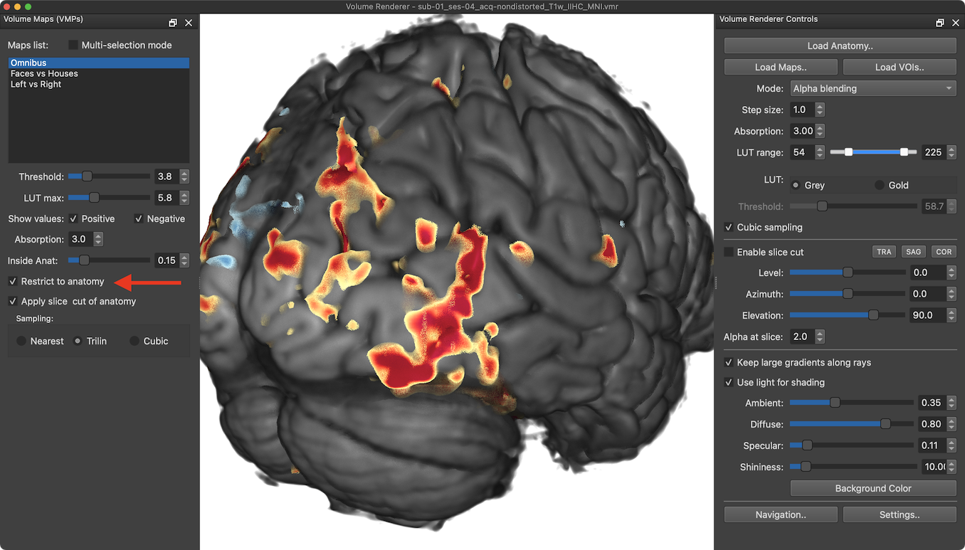
By turning on the Restrict to anatomy option (see red arrow above), map values can also be restricted to the visible anatomy, i.e. to locations where volume rendering rays reach an opaque threshold while integrating depth information. With a default (relatively high) anatomical Absorption value (3.0), this leads to render results showing map values at the "surface" of the brain, looking similar to renderings of mesh surfaces with map overlays (see screenshot above).
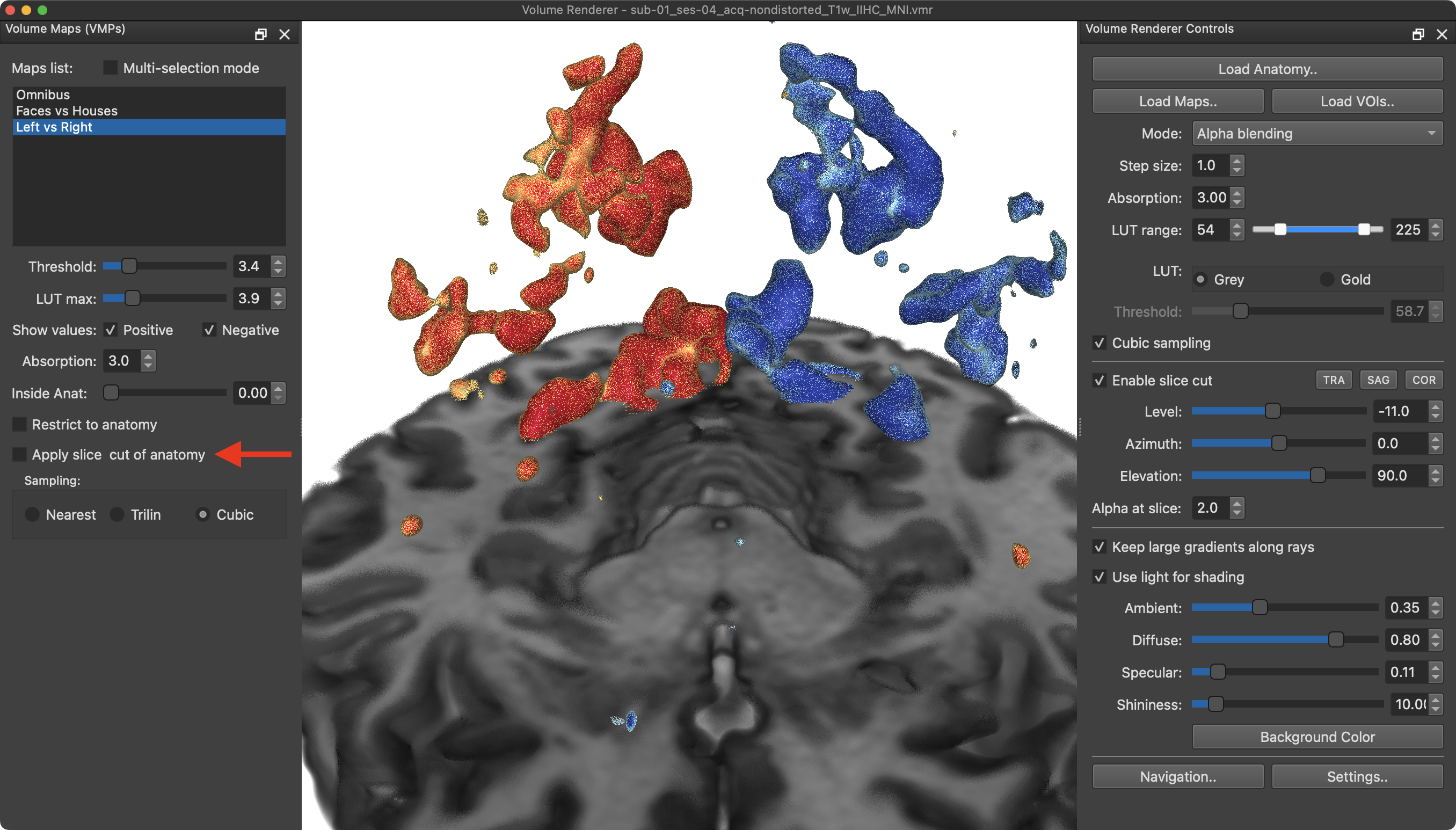
Slice Cut Options
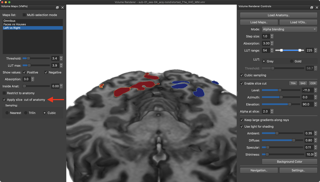
Another important option that influences the visualization of maps are anatomical slice cuts. As default, anatomical slice cuts are applied also to volume maps as shown in the first (upper) screenshot below. In this mode, only map values that intersect the cut slice are visualized (similar as when slicing meshes in the 3D viewer). By turning off the Apply slice cut of anatomy option (as well as the Restrict to anatomy option), map values are not cut but shown in the space exposed by the anatomical slice cut as shown in the second (lower) screenshot below.
Overlaying Multiple Maps
It is sometimes useful to show multiple maps at the same time. This can be achieved by turning on the Multi-selection mode option (see red arrow below), which exposes selection boxes on the left side of each available map (see yellow arrow below). With multi-selection mode enabled, Individual maps can be turned on and off making it possible to select multiple maps instead of only one map in standard selection mode.
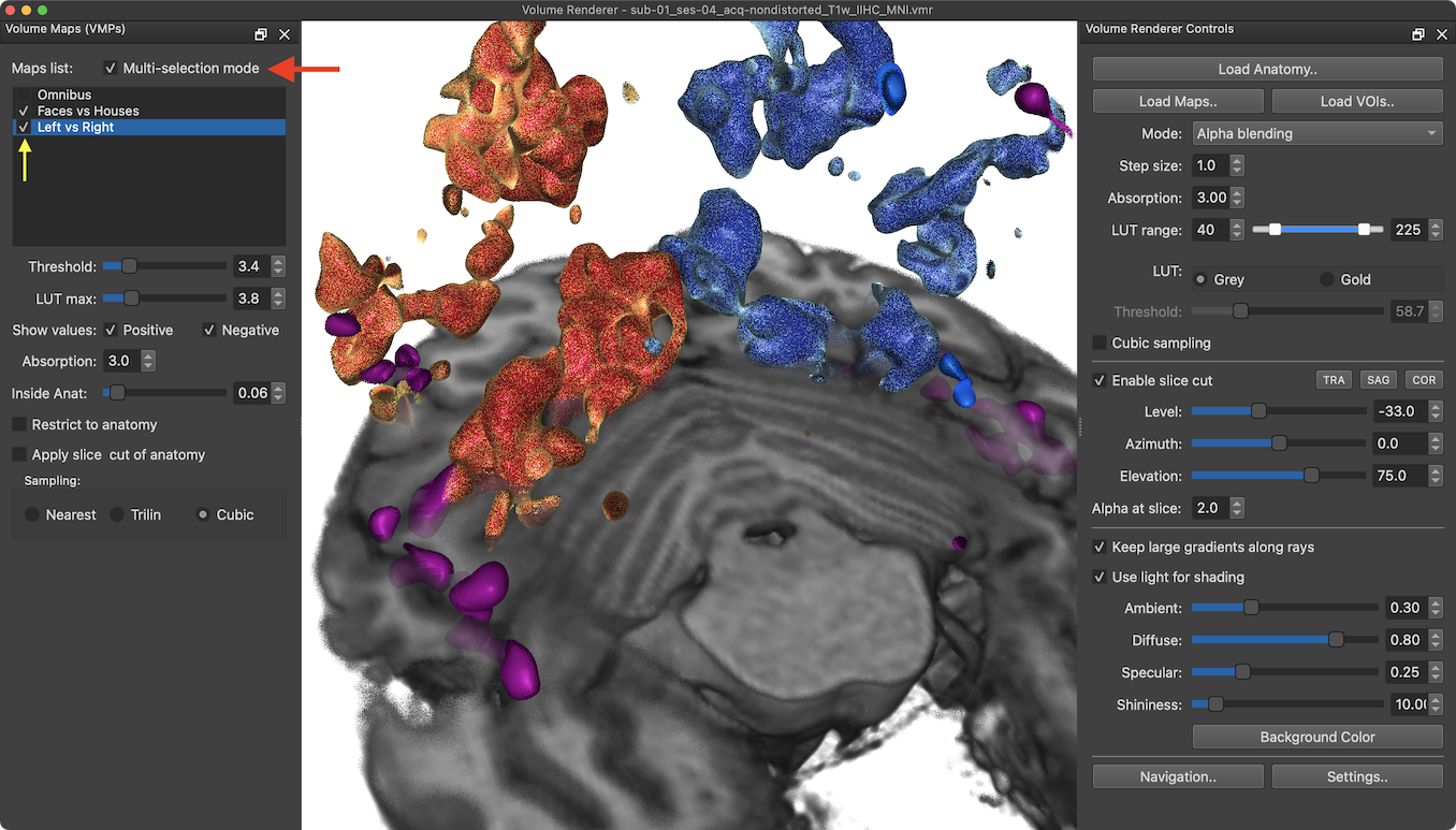
In the screenshot above two maps have been selected for display ('Faces vs Houses' and 'Left vs Right'). In order to identify which active regions belong to which map, it is advised to assign different LUTs to each map. In the screenshot above, the 'Left vs Right' map uses the default LUT, while the 'Faces vs Houses' map uses a Magenta LUT. The chosen viewpoint and slice cut reveals several magenta-colored face regions mainly in mid-level ventral visual cortex.
Map Interpolation Options
As default, selected maps are overlaid using trilinear sampling, which usually results in nice visualizations. Slightly better results than with the Trilin option might be obtained when using the Cubic interpolation option in the Sampling field.
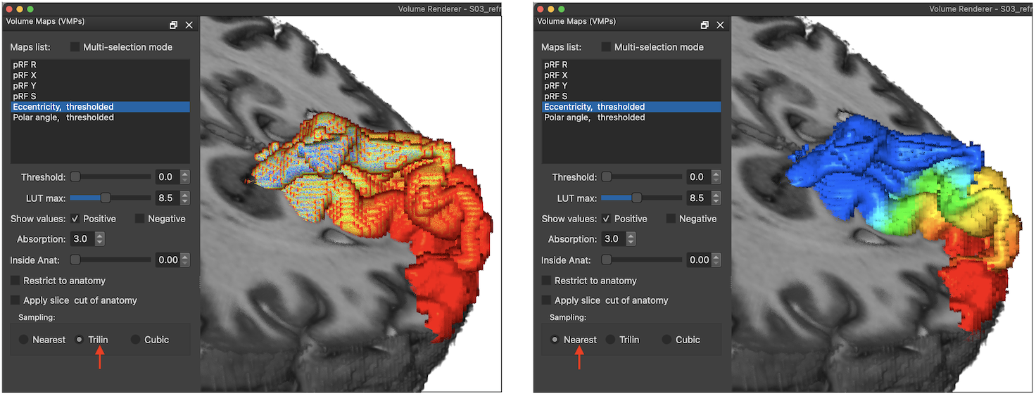
There are, however, cases where interpolation detoriates the result. Such an example is shown below where a calculated (ideal) eccentricity map is shown. Using the default trilinear interpolation (see red arrow in left panel) leads to unintended color values at the boundaries of the map. Using instead nearest neighbor interpolation by selecting the Nearest option (see red arrow in panel on the right) avoids this map border interpolation issues leading to the expected eccentricity colors as shown on the right side below.
Copyright © 2023 Rainer Goebel. All rights reserved.